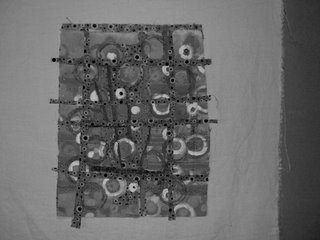
 I investigated my limited iphoto tools. I can go to black and white, do brightness and contrast and red-eye. No neat photoshop elements like posterization or vectorization.
This is the orange quilt in black and white. If you click on it, you can see that there actually is a depth of field to the painted surface and the new lines with dark dots has in fact made a difference. The white painted circles (this was actually a circle stamp) still dominate rather than help. I like the piece and hope that I will think of some small inprovement that will "do the trick" and bring it around.
The other, planetary quilt, will be having some of the borders removed--replaced?? Don't know yet and the planets will be stitched down. I am quite interested in the timtex shaped border on the edge a la Sonji. I do have to enter the library once again to shelve non-fiction for 3 hours but as soon as that is done---I will return to my studio and work, work, work.
I also plan to learn how to turn the flash off when I photograph my work. The flash is distorting the color and I'm giving you bad photos to look at and consider. I had not even thought about turning it off. Sometimes. I. Wonder. About. My. Thinking. Processes.
It took me a while to learn how to delete. To download to the computer. To upload to the blog. I am a pencil and paper girl. No techno whiz. I still think I'll get a written letter in the mail. Geez!
3 comments:
Yep, there's not a huge contrast between the background and the strips, but there's some. I kind of liked that striped border you had on it in the last pic (the background of the planetary quilt pic).
Hi Joanne, I am wondering if the problem is that you don't seem to have a focal point with this peice. it is an all over pattern that works if you want an all over pattern. if you look at your peice below done in blue, it is a simpler design with a shape that draws your eye, becoming more interesting to look at. In the circle piece your eye is going all over but it is evenly textured so you don't have the contrast of an area where your eye is drawn too and stays for a bit. Maybe a calm area, or where the scale drastically changes. try cropping the image on your computer and looking at a smaller area and see how you feel about it.
You know there are things that are working, contrast in value/color, contrast in size of patterning. It is so hard when you keep looking at a peice and are not quite sure why it doesn't feel right. sometimes turning a piece upside down can also give clues. good luck.
I take several photos at the same time with my digital camera, some with flash and some without. Since I use mostly automatic settings except for the flash, it seems like that camera reads light slightly differently and usually one of the photos will be better than another for some mysterious reason.
Post a Comment